Flip Academy
Overview
—an internship project, designing an engaging tutorial for financial education
Takeaways: Consistency in design, gamification, and connections to the real world engage young learners and ensure workflows such as tutorials, account creation, and onboarding are seamless and inviting.
Well executed design in UX and EdTech allow users (learners) to focus on learning tasks without becoming anxious or distracted by inconsistencies or flaws in their learning platform.
KPI’s: User drop-off rate; Onboarding completion rate
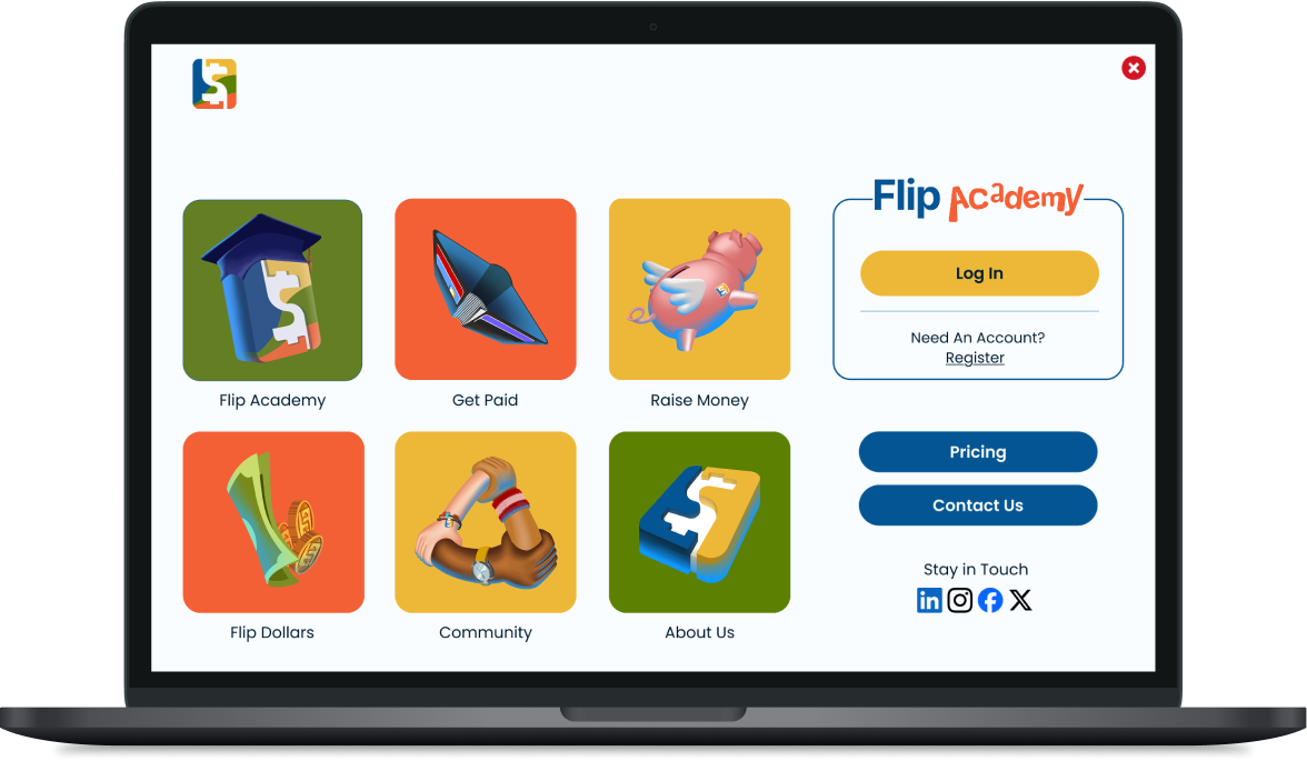
Flip Academy Onboarding Re-design
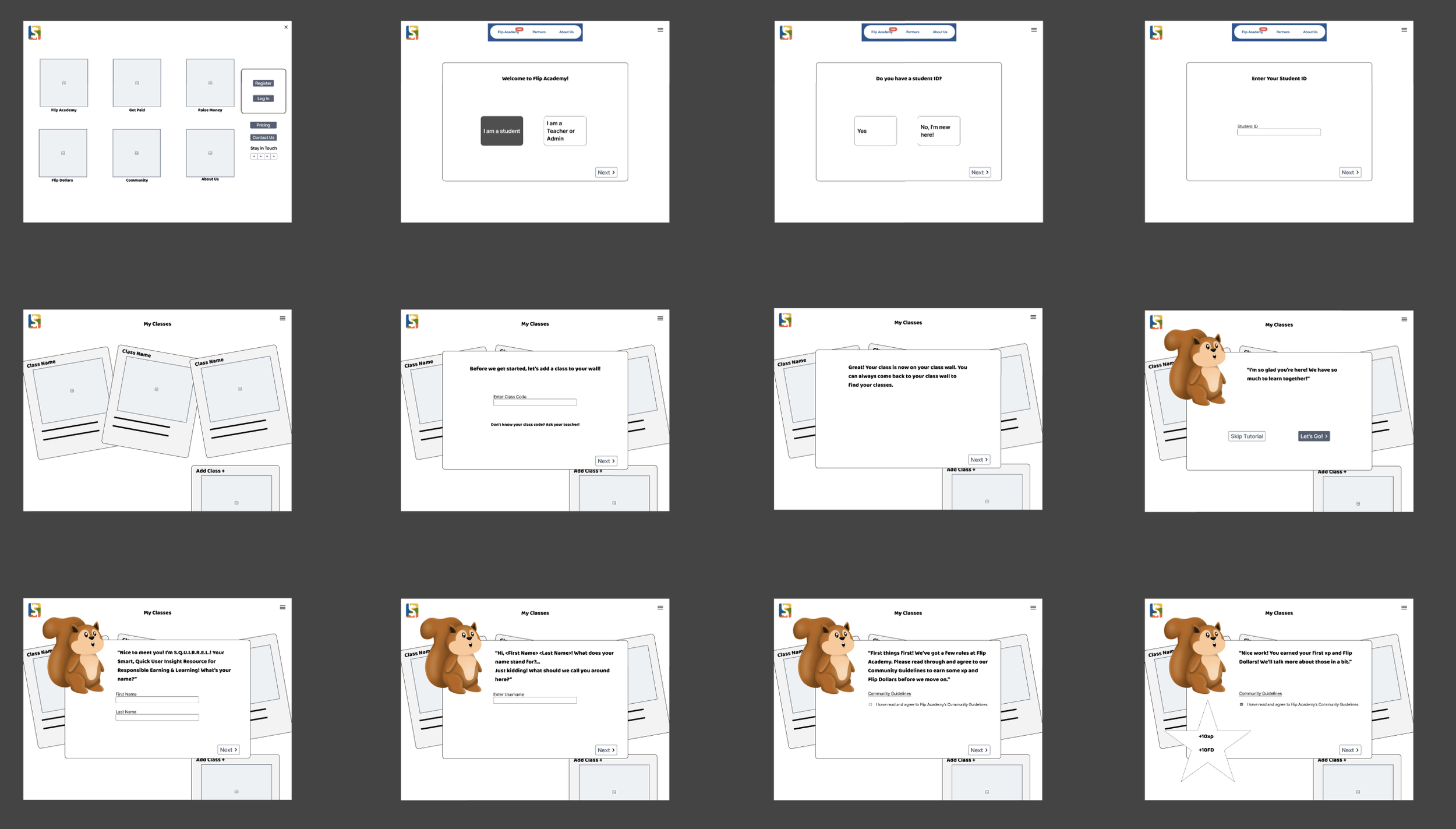
Flip & Floss is a small financial education company, providing tools to youth for learning skills such as money management, saving, and investing. They are developing a platform called Flip Academy, designed for use in the elementary and secondary classroom. Flip Academy’s onboarding flow teaches its users how to use the platform, guides them through connecting a bank account to their profile, and requires them to agree to Flip Academy’s Community Guidelines and connect at least one school class to their account. I worked as part of a small team of UX Designers to revamp the onboarding flow for Flip Academy.
Role: Exploratory research; Ideation; Sketching; Wire framing; Prototyping; Iteration
Tools: Figma; Miro; Figjam
Dates: November - December, 2025
Standards: Nielsen Usability Heuristics: Referenced throughout by (NH#)

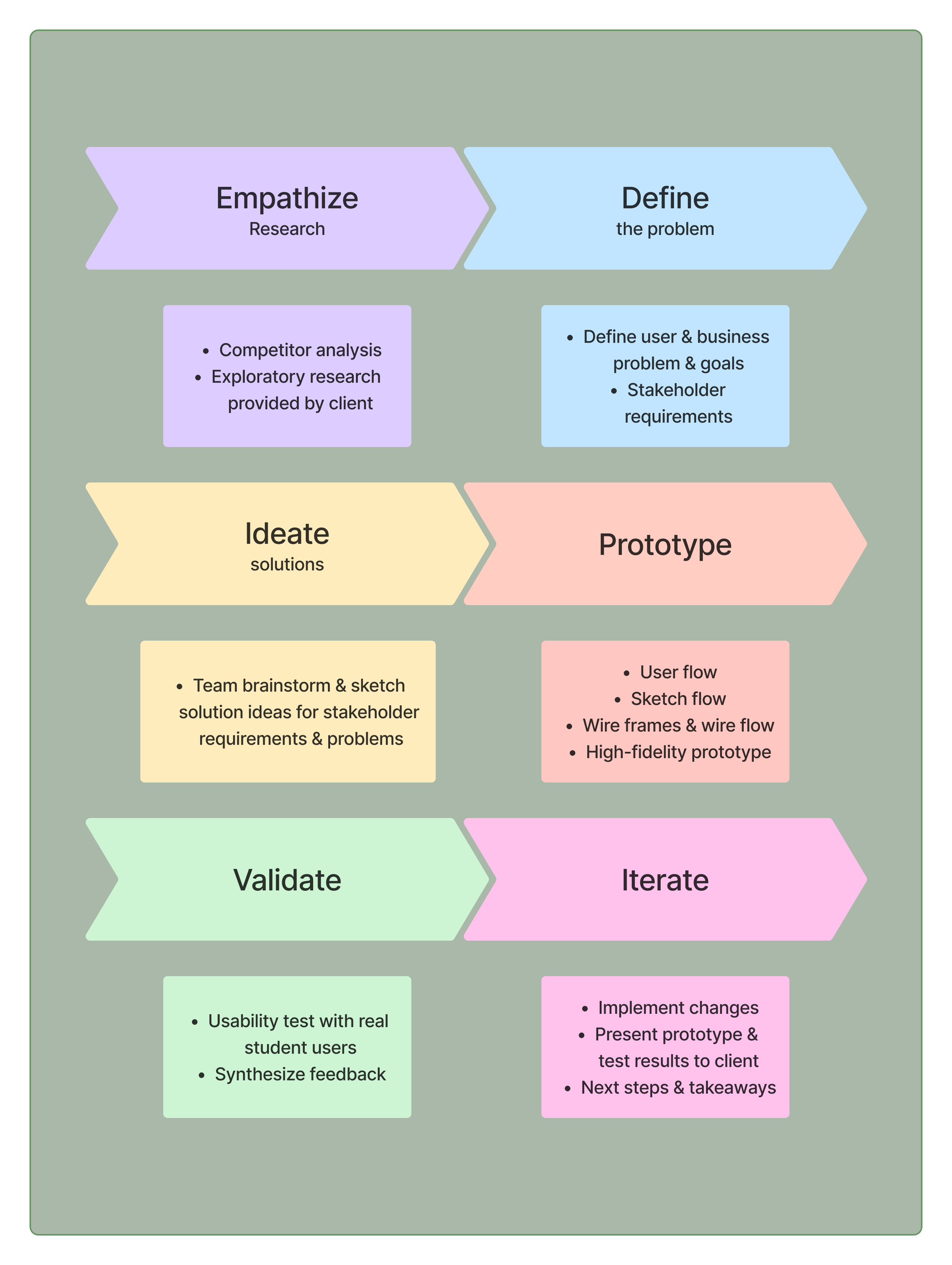
Design Process
The Problem
The current onboarding process for Flip Academy lacks engaging content and interactivity which lead to a steep learning curve and risking a high drop off rate.
Business Goals
Increase onboarding completion rate for student users
Decrease drop-off at “add bank account” step of onboarding
User Goals
How might we engage K-12 Flip Academy users as they are onboarding, guiding them to complete the onboarding process?
How might we incorporate principles of gamification and interactivity into the Flip Academy onboarding flow to empower new Flip Academy users to navigate the platform with ease?
How might we guide users seamlessly through onboarding with intuitive design, minimizing cognitive load and maximizing interactivity?
Stakeholder Requirements & Our Specific Solutions
I’ll first discuss three specific examples of stakeholder requirements and our solutions, then go through the entire design process which led to these solutions.
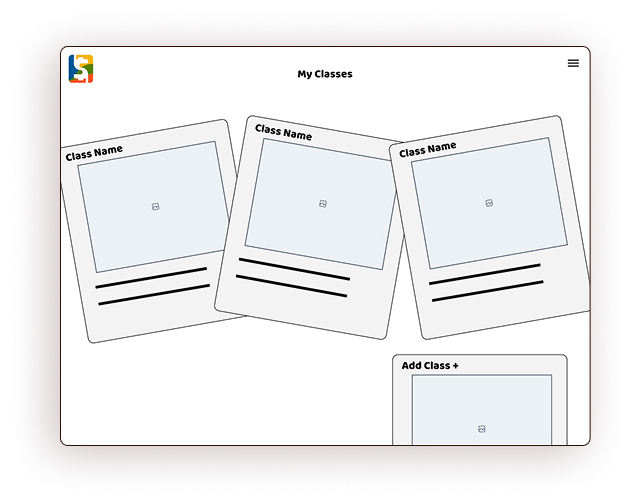
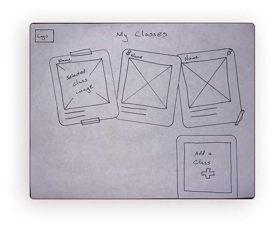
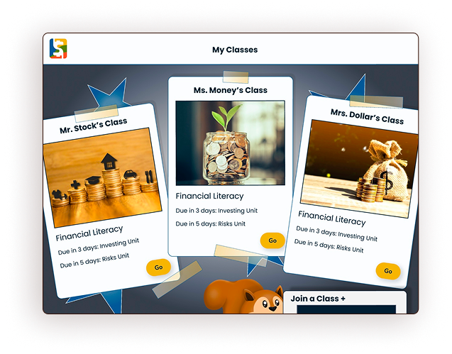
A re-designed Classes page with a theme to engage users
Ideation & Solution: During my classroom teaching time, I noted the love students have for snapping and hanging quick-print photographs in their lockers. I did so during my high school years, and the trend continues today! Lockers act as a “home base” during frantic school days, and a little reminder of home(NH2) can be comforting and re-aligning. I wanted the classes page to function this way for students. This “locker” would act as a real world connection and integrate bright, happy colors.
Original
Wire frame
Sketch
Prototype
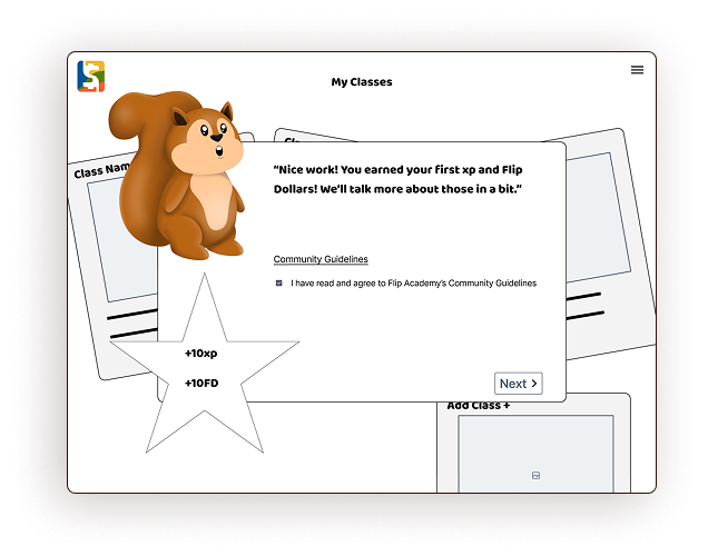
2. Require student users to read & agree to Flip Academy’s Community Guidelines
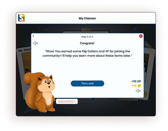
Ideation & Solution: Reading community guidelines (rules) is a prime spot to lose engagement with young users. It is also a business requirement. To minimize drop-off at this step, we chose to incorporate a cartoon squirrel character as a guide. Later in the ideation process, this squirrel would become students’ guide through our tutorial flow, adding some humor and fun. Additionally, we added gamification to this step of onboarding, rewarding users with experience points and in-site currency (Flip Dollars) as a reward.
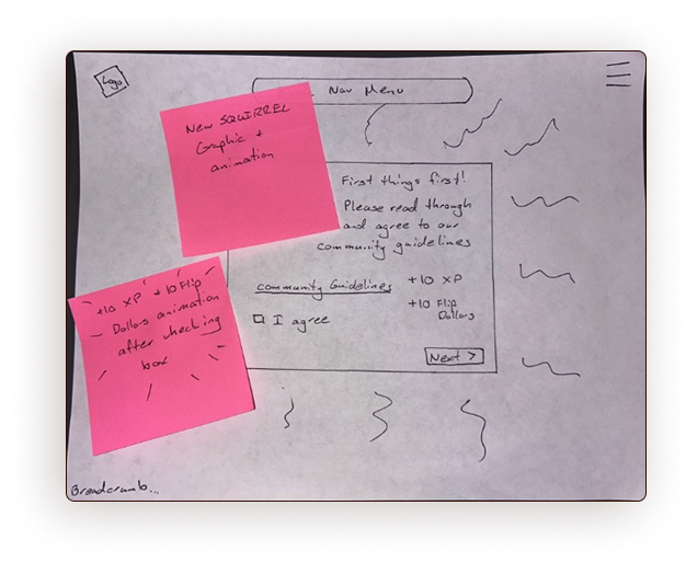
Sketch
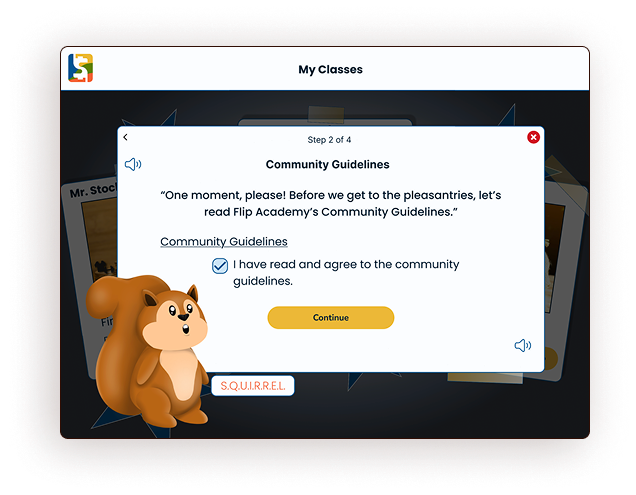
Prototype
Wire frame
Prototype
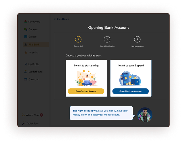
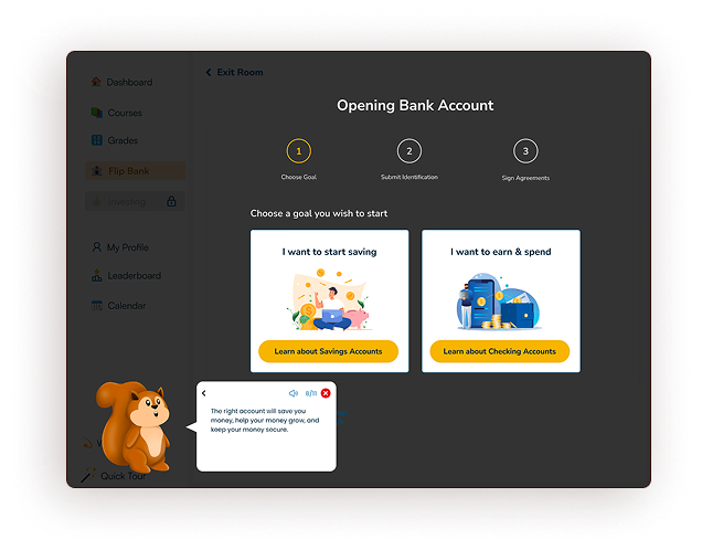
3. Incorporate a tutorial step for student users & parents to add a bank account
Ideation & Solution: In Flip Academy’s original flow, users were prompted during onboarding to open a bank account through their platform. In testing, users reported feeling ill-informed while they chose which type of account to open, resulting in a high drop-off rate at this step. To remedy this, our team added an informational screen(NH6) to the flow, allowing users to learn more about the purpose of checking accounts and savings accounts before choosing which to open. More on this solution can be seen under “Bugs & Fixes.”
Original
Prototype
The Onboarding Flow Design Process
In addition to the specific requirements above, our team was asked to revamp Flip Academy’s entire onboarding flow, from landing page to user dashboard, incorporating a series of tutorial steps and utilizing the principles of engagement discussed above: bright colors(NH4), characters, storytelling(NH2), gamification, and connections to the real world(NH2).
Introductory & Market Research
At the outset of our work, Flip & Floss’s team gave us a few pointers on their market research, sharing rules they’ve learned for the best ways to engage young (primary) and older (secondary) students. Additionally, I researched our competition in the marketplace for children’s financial education apps. Specifically, I signed up for Zogo, Acorns Early, and Greenlight. I have chosen not to use specific screenshots of these platforms in this case study, but the conclusions I drew from this research are incorporated into our Guiding Principles.
Personas, User Research, & Guiding Principles
Flip & Floss had conducted exploratory research before the arrival of my team, and provided us with user personas and empathy maps at the outset of our project. They also asked us to utilize the in-house style guide. As such, these steps are omitted from my case study.
Younger users (elementary) are best engaged by bright colors, characters, storytelling, and game components, such as competition among friends and an in-game currency.
Older users (secondary) are best engaged with social integration and opportunities to interact with “real world” elements of financial literacy.
Our team set about to utilize these principles, along with Nielsen’s Usability Heuristics (referenced as NH#), to maximize engagement in the new onboarding user flow.
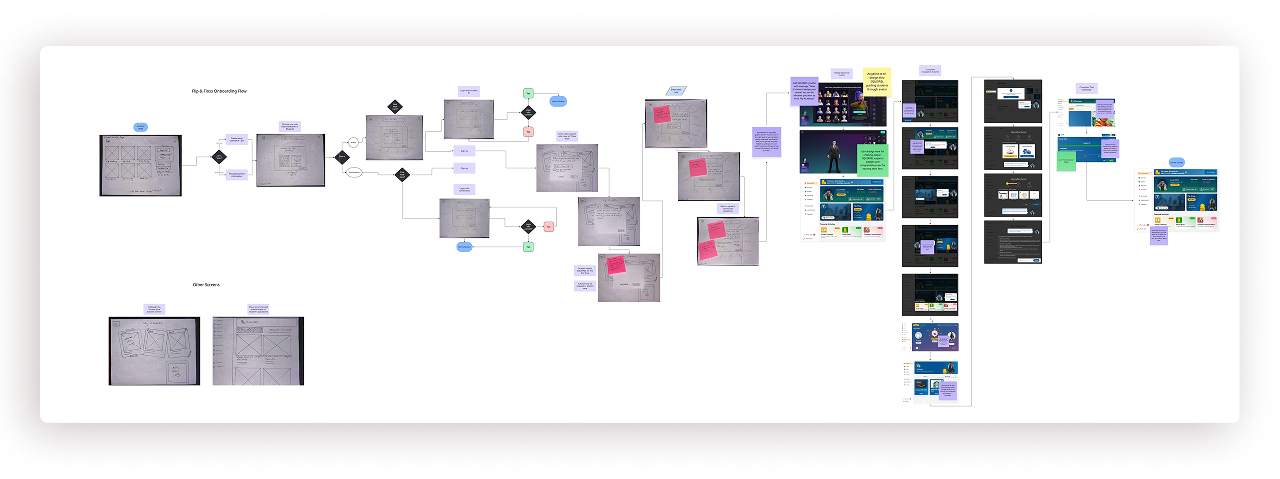
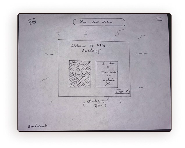
First, I created a sketch flow of the entire onboarding process, from landing page to account creation to tutorial to user Dashboard, incorporating some existing screens provided by Flip & Floss.
Next, my team turned these sketches into wire frames.
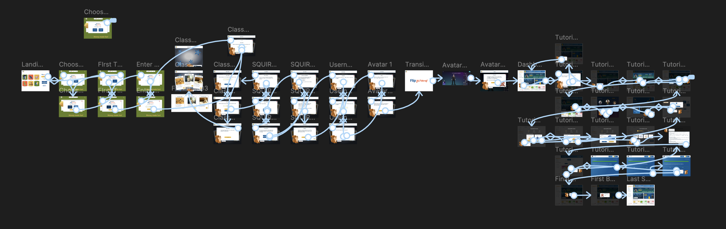
Finally, I created a clickable, high-fidelity prototype of the entire onboarding flow, incorporating some pre-existing screens from Flip & Floss.
Notable Design Choices & Rationale
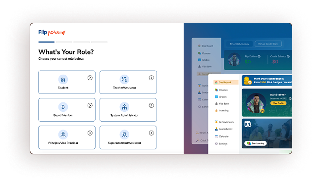
Problem
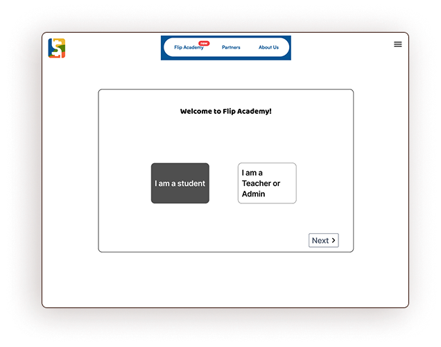
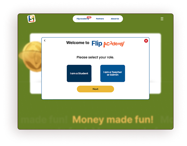
In the original flow, the role selection page gave the user too many options, risking cognitive overload.
Students are the only users at risk of dropping off in the onboarding flow. Therefore, this page should make their choice as easy and clear as possible. We consolidated the user’s options(NH8), used brand colors for familiarity(NH4), and made the most likely choice obvious.
Solution
Original
Wire frame
Sketch
Prototype
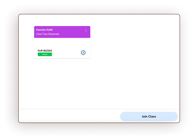
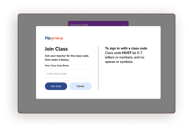
Problem
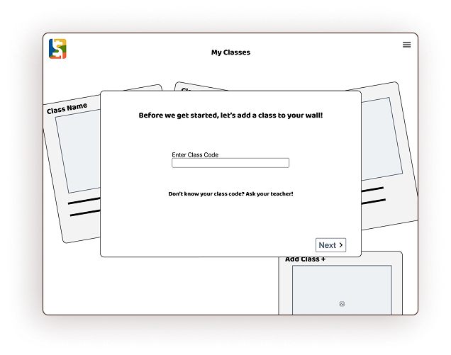
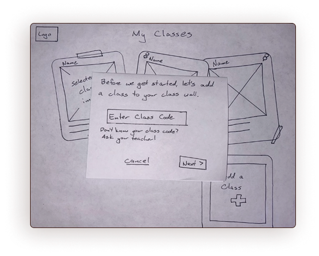
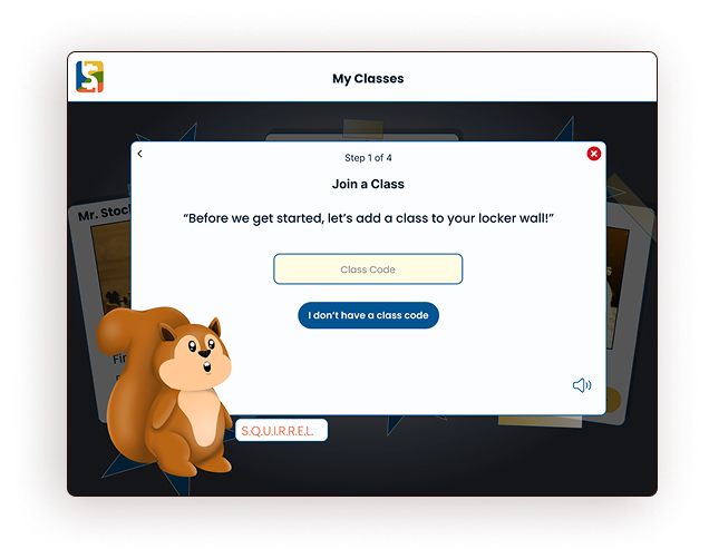
Users must enter a class code during onboarding to associate their school class with their account, adding a class to their “wall.” The original screen used pure white, lacked engaging content, and contained too much confusing text.
Solution
We placed this screen in the context of the “locker wall”(NH2) and turned the instructional text into a dialogue between you and your guide squirrel. Finally, we simplified the instructions, added color and brand content(NH8), and added text-reader functionality and a back button(NH3) to increase familiarity and accessibility.
Original
Wire frame
Sketch
Prototype
Testing & Outcomes
After I created a clickable prototype of our onboarding flow, my teammate completed three user tests with middle and high school students. These students hadn’t used Flip Academy before and were offered a small financial incentive for their time.
User Testing Results
Users found the flow to be fun, seamless, and usable.
The youngest user needed help with basic term definitions related to technology use, such as “login” and “register”.
Testers noted a couple of text placement and size inconsistencies(NH4) and gave us feedback about button color and placement. I made this changes for the final iteration of the prototype.
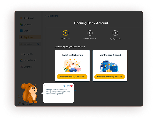
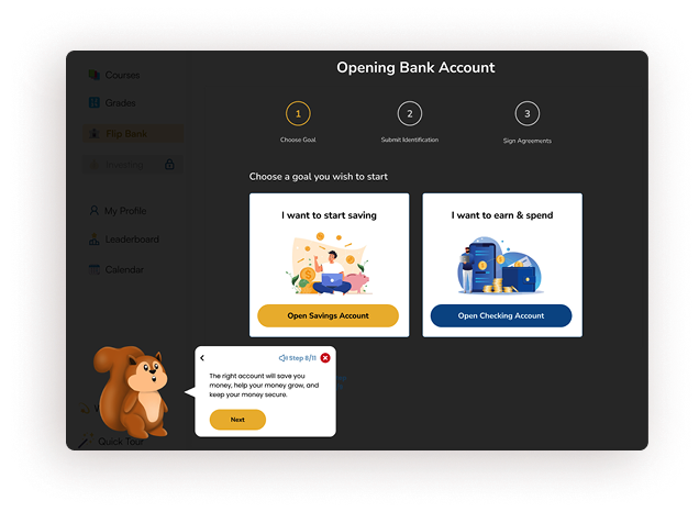
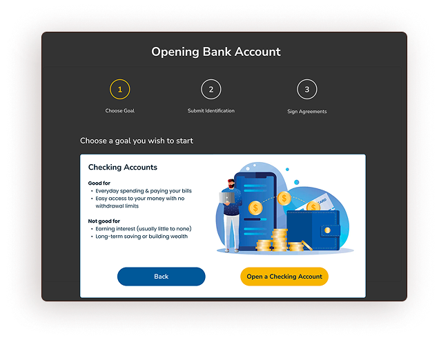
Bank Accounts Fix
All three users tried to bypass the “Opening Bank Account” portion of our tutorial by clicking “next” in the speech bubble, prompting SQUIRREL to encourage them to choose which type of bank account to open. At this point, two of the three test users reported that they didn’t know enough about the types of accounts to make this choice.
To fix this, we removed the “next” button in the speech bubble, made the choice buttons for the two bank accounts identical, and forced a step in which users learn about each type of bank account before choosing one(NH10).
Prototype
Iteration p.1
Iteration p.2
Next Steps
Evaluation
With our limited time frame, our team was only able to test our initial prototype with three users. Next, the newest flow iteration should be tested with at least five potential users, ensuring the effectiveness of the newest changes.
Continuous Data Monitoring
When Flip Academy is widely released, the design team at Flip & Floss should closely monitor analytics such as click-through rates for the various stages of onboarding, the most common drop-off sites in the process, and continuously update and iterate on the onboarding flow based on this data.
Curriculum Design
As the courses for Flip Academy are written, tested, and released, the onboarding flow should be continuously updated to reflect the content of the courses. If there’s a SQUIRREL in the introductory tutorial, users should expect to see a SQUIRREL as they learn on the platform.
Takeaways
Consistency in Design: Much time was spent on this project retroactively designing for consistency. Test users found the most consistent design choices the clearest. From the beginning of a project, err on the side of consistency and simplicity.
Learning in a flow state: People learn best when they are challenged and not anxious. Thoughtful and caring design allows users to focus on the learning task rather than worrying about the usability of the tool.
Regular cross-team collaboration: The entire Flip & Floss team meets weekly—CEO and all. Design choices didn’t have to wait long to be heard, approved, and offered feedback. This project’s ambitious scope and timeline would not have been possible without these meetings.